With the impending release of Tic Toc Tom Volume 3 Issue 3 (what a mouthful… let’s hashtag it like the cool kids! #TTTV3I3. It’s 3% less awkward!), I thought I would take the opportunity to talk about the first two covers and provide a teaser of the third.
As you are now aware, the concept of the covers is to visualize the main storyline through the ‘eyes’ of one of the principle characters.
Since its inception, Tic Toc Tom has been an anthology. A collection of disparate stories, bound by the artists’ interpretations of the central characters. As a result, it has been tricky to create covers that worked with all of the stories. Typically, artists used it as an opportunity to create a pin-up or iconic-image (for some background on the two, read Johnny Sagness’ wonderful “Creator’s Corner – Jivin’ Johnny Sagness“).
My idea was to create images that referenced the main storylines, shared a stylistic approach and treatment, captured a dramatic moment and, still worked as pin-ups for the other stories within.
Stylistically I focused on the eye area as it’s traditionally thought of as the “window to the soul”. To emphasize this I restricted colours outside of that area to muted and neutral ones, while the colours within the area are richer and more intense.
In terms of capturing the moment, I wanted to create images of that singular point in time at the beginning of a major confrontation. That moment when adrenalin is high and tempers are hot.
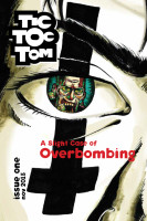 For Issue 1 I focused on Industrial Girl’s clash with a zombie. It made for an enticing visual and would hopefully invite readers into this mad new world.
Her trademarked inverted cross tattoo (or is it makeup?) worked well in this context as both an intriguing symbol and a link to the “damned” that she was fighting.
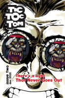 In Issue 2, Grady and Tic Toc Tom’s battle was the obvious choice. There’s a primal aspect to Grady’s reflections in Tom’s goggles that is powerful and raw.
And let’s not downplay Tom’s gritted teeth. Gritted teeth is one of the most beloved crutches imageries in all of comic history!
Which one is the animal? Grady or Tom?
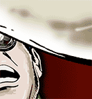 Which brings us to Issue 3. I don’t want to give too much away so, here’s a close-up of the cover to come.
Let’s just say that the final image in the 3-cover set brings the concept full circle.
As for where the title of each issues comes from, I took them from actual album names or song titles. Each one encapsulates what I interpreted as the thrust of the individual issues.
Issue 1 – A Slight Case of Overbombing by The Sisters of Mercy
Issue 2 – There’s a Light That Never Goes Out by The Smiths
Issue 3 – Spoiler! Help Us / Save Us / Take Us Away by KMFDM
What do we have in store for the Issue 4 cover? We don’t know yet! But good things come to those who wait.
Paul Marhue

